
In today’s blog we will talk about PowerApps Components.
– What are PowerApps Components ?
Components are reusable building blocks for canvas apps so that app makers can create custom controls to use inside an app, or across apps using a component library. Components can use advanced features such as custom properties and enable complex capabilities. This article introduces component concepts and some examples.
Components are useful in building larger apps that have similar control patterns. If you update a component definition inside the app, all instances in the app reflect your changes. Components also reduce duplication of efforts by eliminating the need to copy/paste controls and improve performance. Components also help create collaborative development and standardizes look-and-feel in an organization when you use a component library.
– How to create Components in PowerApps ?
You can create a component from within an app as explained in this blog, or by creating a new component inside a component library. A component library should be used for requirements to use components across multiple app screens. You can also copy the existing components into an existing or a new component library.
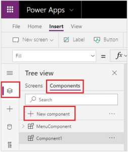
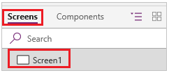
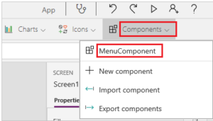
To create a component within an app, go to Tree View, select the Components tab, and then select New component:
Selecting New component opens an empty canvas. You can add controls as part of the component definition on the canvas. If you edit a component in the canvas, you’ll update instances of the same component in other app screens. Apps that reuse an already created component can also receive component updates after you publish component changes.
You can select a component from the list of existing components in the left pane after you select a screen. When you select a component, you insert an instance of that component onto the screen, just as you insert a control.
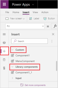
Components available inside the app are listed under the Custom category in a list of components inside the tree view. Components imported from component libraries are listed under the Library components category:
– Custom properties
A component can receive input values and emit data if you create one or more custom properties. These scenarios are advanced and require you to understand formulas and binding contracts.
Input property is how a component receives data to be used in the component. Input properties appear in the Properties tab of the right-hand pane if an instance of the component is selected. You can configure input properties with expressions or formulas, just as you configure standard properties in other controls. Other controls have input properties, such as the Default property of a Text input control.
Output property is used to emit data or component state. For example, the Selected property on a Gallery control is an output property. When you create an output property, you can determine what other controls can refer to the component state.
The following walk-through further explains these concepts.
– Example Component
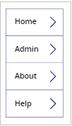
In this example, you’ll create a menu component that resembles the following graphic. And you can change the text later to use it in multiple screens, apps, or both :
Now let’s create the new component :
1. Create a blank canvas app.
2. In the Tree View, select Components and then select New component to create a new component.
3. Select the new component in the left pane, select the ellipsis (…), and then select Rename. Type or paste the name as MenuComponent.
4. In the right-hand pane, set the component’s width as 150 and its height as 250, and then select New custom property. You can also set the height and width to any other value as appropriate.
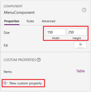
5. In the Display name, Property name, and Description boxes, type or paste text as Items.
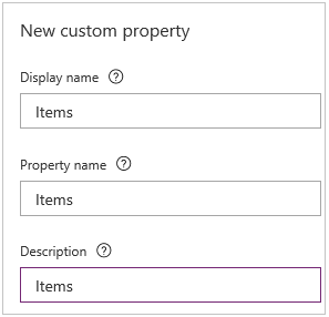
Don’t include spaces in property name because you’ll refer to the component by this name when you write a formula. For example, ComponentName.PropertyName.
The display name appears on the Properties tab of the right-hand pane if you select the component. A descriptive display name helps you and other makers understand the purpose of this property. The Description appears in a tooltip if you hover over the display name of this property in the Properties tab.
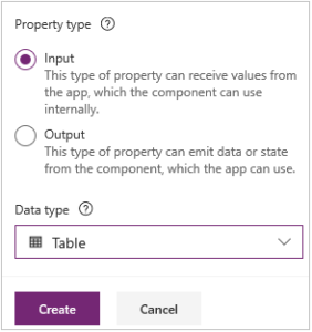
6. In the Data type list, select Table, and then select Create.
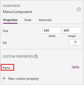
The Items property is set to a default value based on the data type that you specified. You can set it to a value that suits your needs. If you specified a data type of Table or Record, you might want to change the value of the Items property to match the data schema that you want to input to the component. In this case, you’ll change it to a list of strings.
You can set the property’s value in the formula bar if you select the name of the property on the Properties tab of the right-hand pane.
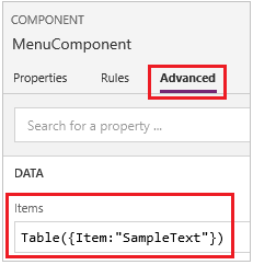
As the next graphic shows, you can also edit the property’s value on the Advanced tab of the right-hand pane.
7. Set the component’s Items property to this formula:
Table({Item:"SampleText"})
8. In the component, insert a blank vertical Gallery control and select Layout on the property pane as Title.
9. Make sure that the property list shows the Items property (as it does by default). And then set the value of that property to this expression:
MenuComponent.Items
This way, the Items property of the Gallery control reads and depends on the Items input property of the component.
10. Optional – set the Gallery control’s BorderThickness property to 1 and its TemplateSize property to 50. You can also update values for border thickness and template size to any other value as appropriate.
– Add Component to a screen
Next, you’ll add the component to a screen and specify a table of strings for the component to show.
1. In the left pane, select the list of screens, and then select the default screen.
2. On the Insert tab, open the Components menu, and then select MenuComponent.
The new component is named MenuComponent_1 by default.
3. Set the Items property of MenuComponent_1 to this formula:
Table({Item:"Home"}, {Item:"Admin"}, {Item:"About"}, {Item:"Help"})
This instance resembles this graphic, but you can customize the text and other properties of each instance.
– Create and use output property
So far, you’ve created a component and added it to an app. Next, you’ll create an output property that reflects the item that the user selects in the menu.
1. Open the list of components, and then select MenuComponent.
2. In the right-hand pane, select the Properties tab, and then select New custom property.
3. In the Display name, Property name, and Description boxes, type or paste Selected.
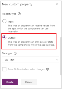
4. Under Property type, select Output, and then select Create.
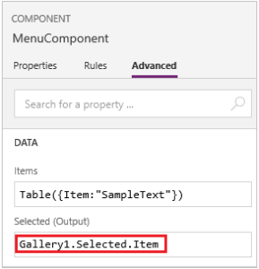
5. On the Advanced tab, set the value of the Selected property to this expression, adjusting the numeral in the gallery name if necessary :
Gallery1.Selected.Item
6. On the default screen of the app, add a label, and set its Text property to this expression, adjusting the numeral in the component name if necessary :
MenuComponent_1.Selected
MenuComponent_1 is the default name of an instance, not the name of the component definition. You can rename any instance.
7. While holding down the Alt key, select each item in the menu.
The Label control reflects the menu item that you selected most recently.
– Scope
Input and output properties clearly define the interface between a component and its host app. By default, the component is encapsulated so that it’s easier to reuse the component across apps, requiring the use of the properties to pass the information in and out of the component. Scope restrictions keep the data contract of a component simple and cohesive, and it helps enable component-definition updates—especially across apps with component libraries.
But there are times when a component may want to share a data source or a variable with its host. Especially when the component is only intended for use in one particular app. For these cases, you can directly access app level information by turning on the Access app scope switch in the component’s property pane :
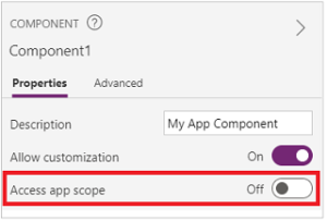
When Access app scope is turned on, the following are accessible from within a component:
- Global variables
- Collections
- Controls and components on screens, such as a TextInput control
- Tabular data sources, such as Dataverse tables
When this setting is turned Off, none of the above are available to the component. Set and Collect functions are still available but the resulting variables and collections are scoped to the component instance and not shared with the app. Components in a component library can never have access to app scope, as there’s no single app scope to refer to. So, this setting isn’t available in this context, and is effectively off. Once imported into an app, and if customization was allowed by the component maker, the switch can be enabled, and the component can be modified to use the app scope.
– Known Limitations
- A custom input property can’t be configured to a custom output property value across same or different instances when you have two or more instances of same component in an app. This action will result in a circular reference warning message. To work around this limitation, you can create a copy of the component inside your app.
- Adding and running Power Automate flows in component libraries is not supported.
- You can’t save data sources or controls that include data from those data sources (such as forms, fluid grids, or data tables) with components.
- You can’t insert a component into a gallery or a form (including SharePoint form).
- Components don’t support the UpdateContext function, but you can create and update variables in a component by using the Set function. The scope of these variables is limited to the component, but you can access them from outside the component through custom output properties.